JR
Jordan Rivera
Product Designer
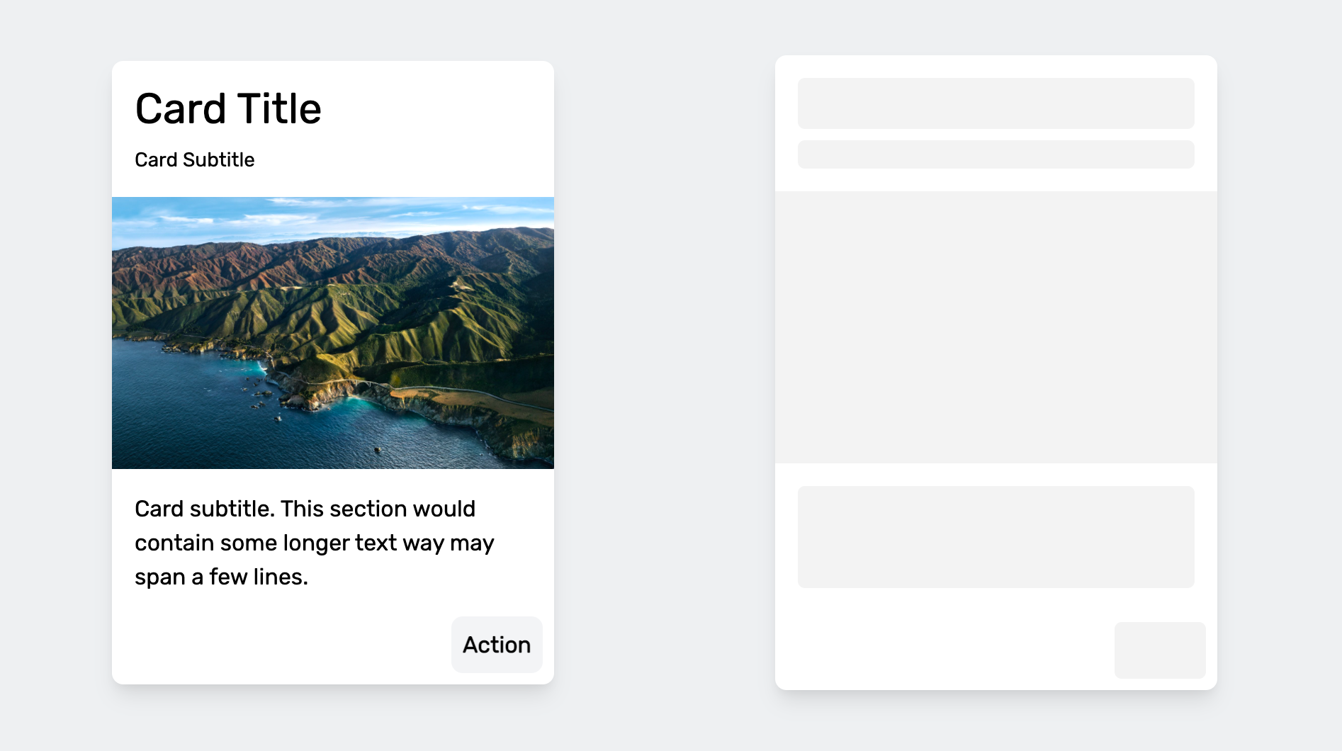
Auto Skelly covers this card with a matching skeleton, then hands the exact same elements back untouched — no re-render, no flash, no separate loading component to maintain.
Auto Skelly turns the real elements already on your page into animated loading skeletons, then hands you back the exact same elements when you're ready to reveal them. No separate skeleton components to build or keep in sync, no framework required.
Why use Auto Skelly?
Load time of on-screen content is a big part of user satisfaction, and image-heavy or data-heavy pages can take a while to become useful. To soften that wait, many products show a "skeleton" — a placeholder silhouette of the content that appears instantly and is swapped for the real thing as soon as it's ready.
Normally that means hand-building a second, skeleton-shaped version of
every component and keeping the two in sync forever. Auto Skelly skips
that: you mark up your real content with a few
skelly-*
classes, and the library measures it, covers it with a matching
placeholder, and — this is the headline feature of v1 — hands you back
the exact same, untouched elements the moment you call
remove(). Nothing is destroyed or re-rendered, so skeletons can be shown,
hidden, and shown again as many times as you like. Try it for yourself
in the live demo below.
Getting Started
Auto Skelly ships as an npm package with ESM/CJS builds, and as a single
IIFE bundle you can drop in with a plain
<script>
tag — no jQuery, no dependencies, no build step required. Pick whichever
fits your project.
1. Install from npm
npm i auto-skellyimport { AutoSkelly } from "auto-skelly";
const skelly = new AutoSkelly();
skelly.apply();2. Or load it from a CDN
<script src="https://unpkg.com/auto-skelly"></script>
<script>
  const skelly = new AutoSkelly();
  skelly.apply();
</script>
3. Or self-host and auto-init
Copy
auto-skelly.global.js
into your project. Add the
data-skelly-auto
attribute to the script tag and Auto Skelly will find and skellify
every
skelly-*
element on the page for you, with zero JavaScript of your own. Great for
static pages; if you need to reveal content programmatically (like the
demo on this page does) create your own instance instead, as shown
above.
<script src="./auto-skelly.global.js" data-skelly-auto></script>Marking Up Elements
Add one of four classes to any element you want skellified. Auto Skelly measures each element's own size and border radius, so the placeholder always matches the space your real content takes up — there's nothing else to configure.
<div class="card">
  <div class="avatar skelly-circle"></div>
  <p class="skelly-text">Jordan Rivera</p>
  <img class="skelly-image" src="cover.jpg" alt="" />
  <button class="skelly-button">View profile</button>
</div>
skelly-text
Add
skelly-text
to any text element. For a single line, Auto Skelly draws one rounded
bar sized to the element's measured width and line-height. If the
element wraps onto two or more lines — its rendered height is at least
twice its line-height — Auto Skelly instead builds a stack of
individual line bars, one per wrapped line, with the last line rendered
shorter, so paragraphs read like real paragraphs instead of one flat
blob.
skelly-image
Add
skelly-image
to an
img
or any element acting as an image. The placeholder fills the element's
exact measured width and height (falling back to its
width/height
attributes, then a 16:9 box) and has no border radius by default, so it
sits flush with the edges of your real image.
skelly-circle
Add
skelly-circle
to avatars and other round elements. The placeholder is sized to the
larger of the element's measured width or height and is always forced
to a perfect circle, regardless of the original element's shape.
skelly-button
Add
skelly-button
to a button-like element. The placeholder matches the button's own
measured size and border radius, so it reads as a disabled version of
the same control rather than a generic block.
Every default described above — size, radius, line count, color,
animation, even how many placeholders render — can be overridden per
element with data-skelly-* attributes. See
Per-Element Overrides below.
Live Demo
This card below is built from plain HTML with
skelly-*
classes on its avatar, text, image, and button. Nothing here is a
screenshot or a separate "loading" component — it's the same DOM
swapping back and forth. Try it out:
Jordan Rivera
Product Designer
Auto Skelly covers this card with a matching skeleton, then hands the exact same elements back untouched — no re-render, no flash, no separate loading component to maintain.
Showing: content
"Auto" clears any color override, so the placeholder falls back to
the stylesheet's own light/dark
--skelly-color
— the default, and the setting that makes dark mode work with zero
JavaScript. See Theming.
Per-Element Overrides
Every sizing and styling decision Auto Skelly makes for you can be
overridden on a single element with a
data-skelly-*
attribute — handy for one-off exceptions without reaching for a
second AutoSkelly instance or a setTheme() call.
| Attribute | Applies to | Effect |
|---|---|---|
| data-skelly-shape | any element |
Sets the shape (text / image /
circle / button) without a
skelly-* class, so elements with your own
class names can be skellified too.
|
| data-skelly-width | all shapes | CSS width for the placeholder, overriding the measured width. |
| data-skelly-height | all shapes | CSS height for the placeholder, overriding the measured height. |
| data-skelly-radius | all shapes | CSS border-radius for the placeholder, overriding the element's computed radius. |
| data-skelly-lines | text | Forces the number of stacked bars (integer ≥ 1) instead of inferring it from measured height — the key to skeletons on empty elements. |
| data-skelly-animation | all shapes |
Overrides the instance's animation for this element only:
pulse / extraPulse /
shimmer / gradient /
none.
|
| data-skelly-color | all shapes |
Overrides the instance's color for this element only. Use
"auto" to opt this one element back into the
CSS-driven default even if the instance sets a color.
|
| data-skelly-highlight-color | all shapes |
Same, for the shimmer sweep's highlight
color.
|
| data-skelly-count | all shapes | Renders N cloned placeholders in place of one (integer > 1) — see Repeating Placeholders. |
| data-skelly-ignore | any element |
Excludes the element even if it matches a
skelly-* class or has
data-skelly-shape.
|
Precedence: for color,
highlightColor, and animation — the three
settings with an instance-level equivalent — a
data-skelly-* attribute always wins over the instance's
constructor option or a later setTheme() call. The
remaining attributes (width, height,
radius, lines, count) have no
instance-level equivalent, so the order is simply: data attribute →
measured value → Auto Skelly's per-shape default.
<p
  class="skelly-text"
  data-skelly-lines="2"
  data-skelly-animation="shimmer"
  data-skelly-color="#fca5a5"
></p>

<!-- No skelly-* class needed when you set the shape explicitly: -->
<div class="hero-banner" data-skelly-shape="image" data-skelly-radius="12px"></div>

<!-- Opt an element out entirely, even if it matches a skelly-* class: -->
<p class="skelly-text" data-skelly-ignore>Always visible</p>
Skeletons Without Content
Auto Skelly normally sizes a placeholder by measuring the real element — but in a single-page app, the row, card, or paragraph you want a skeleton for often doesn't exist in the DOM yet: it only renders once the data that fills it has arrived. There's nothing to measure.
For that case, put
data-skelly-lines="3"
on an otherwise empty
.skelly-text
element. Auto Skelly skips measurement entirely and builds a fixed
3-line skeleton from line-height math alone, so you can paint the
loading state before your real markup — or your data — exists at all.
<!-- Nothing has rendered here yet — no text, no measurable size -->
<div class="skelly-text" data-skelly-lines="3"></div>skelly.apply(); // paints a 3-line skeleton immediately, no layout required
const comment = await fetchComment();
container.innerHTML = renderComment(comment); // the real markup exists now
skelly.remove();Repeating Placeholders
Lists and tables usually render one template row against an array of
real data, not N hand-written rows.
data-skelly-count="5"
clones a single element's placeholder that many times, so one row in
your markup can stand in for a whole list while it loads.
<ul>
  <li class="skelly-text" data-skelly-count="5">Jordan Rivera — Product Designer</li>
</ul>
Try it — five placeholder rows collapse back into the single real row on reveal:
Showing: 1 row (real data)
Async in One Line
while(promise, root?)
wraps a fetch in a single call: it applies, awaits the promise, and
always removes — even if the promise rejects — then resolves or
rethrows exactly as the wrapped promise would.
const skelly = new AutoSkelly({ root: card });

const profile = await skelly.while(fetch("/api/profile").then((r) => r.json()));
render(profile);
apply(root?)
also returns an idempotent disposer scoped to that one call — calling
it removes just the elements that call painted, which pairs neatly
with React's useEffect cleanup function:
useEffect(() => {
  const skelly = new AutoSkelly();
  return skelly.apply(ref.current); // cleanup function === remove for this call
}, []);
Avoiding Flash and Flicker
Skeletons have their own UX failure mode: if content loads almost
instantly, painting a skeleton for a single frame just adds an
unnecessary flash. And if content finishes loading a moment later,
removing the skeleton right away can make it flicker in and straight
back out. Two options fix both — both default to
0
(off, the original synchronous behavior):
delay
— wait this many ms before painting a skeleton at all. If
remove()
(or the promise passed to
while()) finishes first, no skeleton is ever painted.
minDuration
— once a skeleton has painted, keep it visible for at least this
many ms, even if the content becomes ready sooner.
const skelly = new AutoSkelly({ delay: 200, minDuration: 400 });

await skelly.while(fetch("/api/data")); // fast responses: no skeleton at all
Below, both buttons drive the same
{ delay: 200, minDuration: 400 }
instance through
while(). Watch closely — the fast response is deliberately uneventful:
Response will render here.
Ready.
The fast button resolves in 100ms — under the 200ms delay — so no
skeleton ever paints; that's the feature working, not a bug. The slow
button takes 1.5s, so the skeleton appears at 200ms and, thanks to
minDuration, is guaranteed to hold for at least 400ms
once it does.
Fade
fade
(ms) cross-fades the placeholder to transparent before restoring the
original on
remove(), instead of swapping instantly. Defaults to
0
(instant — the original behavior). If
minDuration
is also set, the fade begins only once any remaining minimum-duration
wait has elapsed.
const skelly = new AutoSkelly({ fade: 300 });

skelly.apply();
// ...
skelly.remove(); // placeholder fades to opacity 0 over 300ms, then the original reappears
Turn on Fade transitions in the live demo above and hit Reveal — the skeleton eases out instead of snapping away.
Dynamic Content
With
observe: true, an
apply()
call keeps watching its root for newly added elements and skellifies
any new skelly-* matches automatically — no need to call
apply()
again after infinite scroll, pagination, or any other DOM insertion.
const skelly = new AutoSkelly({ observe: true });
skelly.apply(list);

// Later, e.g. once an infinite-scroll page loads more rows:
list.insertAdjacentHTML(
  "beforeend",
  '<li class="skelly-text" data-skelly-lines="2"></li>'
);
// No extra apply() call needed — the new <li> is skellified automatically.
Apply / Remove Lifecycle
apply()
finds every matching
skelly-*
element, covers it with a placeholder, and hides — but does not
remove — the original. Calling it again is safe: elements already
covered are skipped.
remove()
restores every covered element back to exactly how it was. Both methods
accept an optional root to scope the operation to part of the page, and
apply()
returns an idempotent disposer scoped to just that call — see
Async in One Line for the React
pattern that unlocks.
toggle(on, root?)
and while(promise, root?) are sugar over the same two calls.
const skelly = new AutoSkelly();

skelly.apply();  // cover every .skelly-* element with a placeholder
// ...fetch data...
skelly.remove(); // restore the original elements exactly as they were

// Scope either call to part of the page:
const card = document.querySelector("#profile-card");
skelly.apply(card);
skelly.remove(card);

// apply() returns a disposer scoped to its own call:
const dispose = skelly.apply();
dispose(); // same effect as remove(), but only for this call's elements

// Sugar for on ? apply(root) : remove(root):
skelly.toggle(isLoading);

// apply() + await + remove(), even if the promise rejects:
await skelly.while(fetchProfile());

// True whenever at least one placeholder is currently showing:
skelly.active;
Theming
Constructor Options
Set defaults when you create your instance, including the timing knobs that control when a skeleton paints and how it disappears.
const skelly = new AutoSkelly({
  color: "auto",          // "auto" (CSS-driven, respects dark mode) or any CSS color
  highlightColor: "auto", // shimmer sweep color; same "auto" behavior
  animation: "pulse",     // "pulse" | "extraPulse" | "shimmer" | "gradient" | "none"
  root: document,         // default root for apply()/remove() with no args
  delay: 0,               // ms to wait before painting a skeleton
  minDuration: 0,         // ms a painted skeleton stays before an early remove() takes effect
  fade: 0,                // ms cross-fade before the original reappears on remove()
  observe: false,         // keep skellifying newly-added matches under root
});
setTheme()
Change the color, highlight color, and/or animation on the fly. It
updates every currently-applied placeholder live, without needing to
remove()
and
apply()
again — this is exactly what the color and animation buttons above are
wired to.
skelly.setTheme({ color: "#374151" });
skelly.setTheme({ highlightColor: "#6b7280" }); // shimmer sweep only
skelly.setTheme({ animation: "shimmer" });
skelly.setTheme({ color: "#111827", animation: "extraPulse" });
skelly.setTheme({ color: "auto", highlightColor: "auto" }); // back to CSS-driven defaults
CSS Custom Properties
Under the hood, placeholders read their color, highlight color, and
animation duration from CSS custom properties, so you can theme them
directly in your own stylesheet too — handy for dark mode via a media
query or class, with no JavaScript at all.
color
and
highlightColor
both default to
"auto", which means Auto Skelly writes no inline
--skelly-color
/--skelly-highlight-color
at all — the stylesheet's own light/dark values take over, so dark
mode works automatically via
prefers-color-scheme
with zero JavaScript. Pass an explicit color to override it, or pass
"auto"
again later to opt back in.
:root {
  --skelly-color: #e3e3e3;
  --skelly-highlight-color: #f5f5f5; /* shimmer sweep */
  --skelly-gradient: linear-gradient(-45deg, #ee7752, #e73c7e, #23a6d5, #23d5ab);
  --skelly-duration: 2s; /* 5s default for "gradient", 1.5s for "shimmer" */
}

@media (prefers-color-scheme: dark) {
  :root {
    --skelly-color: #374151;
    --skelly-highlight-color: #4b5563;
  }
}
Animations
Pass any of these to
animation
or
setTheme(). Try each one on the live demo above.
| Value | Description |
|---|---|
| pulse | The default. A gentle opacity fade in and out. |
| extraPulse | A bolder scale-and-shadow pulse, more attention-grabbing than the standard pulse. |
| shimmer |
NEW. A light sweep glides across the placeholder — the
look most modern skeleton-loading UIs use. Its highlight
color is themeable separately via
highlightColor.
|
| gradient | An animated diagonal gradient sweep across the placeholder. |
| none | A static, unanimated placeholder in a solid color. |
Accessibility
Auto Skelly handles a few accessibility details for you automatically:
aria-hidden="true", so screen readers skip the fake content entirely.
aria-busy="true"
for as long as any of its children are skellified, and it's
removed automatically once every sibling has been restored.
prefers-reduced-motion
media query, so visitors who've asked their OS for reduced motion see
static placeholders instead of moving ones — no configuration needed.
API Reference
Options
Passed to new AutoSkelly(options).
| Option | Type | Default | Description |
|---|---|---|---|
| color | string | "auto" |
Placeholder background color. "auto" writes
no inline override, so the stylesheet's light/dark
--skelly-color defaults apply — see
Theming.
|
| highlightColor | string | "auto" |
Highlight color for the shimmer sweep. Same
"auto" behavior as color.
|
| animation | "pulse" | "extraPulse" | "shimmer" | "gradient" | "none" | "pulse" | Placeholder animation. |
| root | ParentNode | document |
Default root that apply()/remove()
search and restore within when called with no argument.
|
| delay | number | 0 | Ms to wait before painting a skeleton; skipped entirely if content is ready first. See Avoiding Flash and Flicker. |
| minDuration | number | 0 |
Minimum ms a painted skeleton stays visible before an
early remove() takes effect.
|
| fade | number | 0 |
Fade-out duration in ms before the original reappears on
remove(). See
Fade.
|
| observe | boolean | false |
Keep watching root for newly-added matches
and skellify them too. See
Dynamic Content.
|
Methods
| Member | Description |
|---|---|
| apply(root?) |
Covers every matching element under
root (or the instance's default root) with a
placeholder. Safe to call repeatedly. Returns an
idempotent disposer scoped to just this call's own
elements — see
Async in One Line.
|
| remove(root?) |
Restores every covered element back to its original
state, optionally scoped to elements within
root.
|
| toggle(on, root?) |
Sugar for on ? apply(root) : remove(root).
|
| while(promise, root?) |
Applies, awaits promise, always removes —
even on rejection — then resolves or rethrows exactly as
promise would.
|
| setTheme({ color?, highlightColor?, animation? }) | Updates color, highlight color, and/or animation on every currently-applied placeholder, live. |
| active |
Read-only getter. true while at least one
placeholder is currently covering content.
|
Links
Thank you for using Auto Skelly! If you have any questions about the library, please feel free to reach out to me at alex@alexgordienko.com